[B-singroom]プロジェクトビル3-Introコンポーネントの作成
26239 ワード
🚀 Introコンポーネントの作成
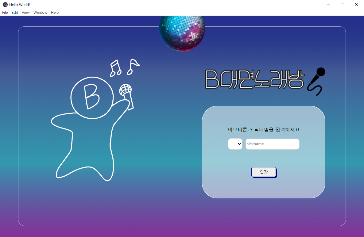
最初の画面では、エレメントキャラクタとキャッチボールプロンプト、アイコン(表情)とニックネームを選択してチャットルームに入ります.
以下の要素が使用され、以前より改善されました.
Intro.js
import React from 'react';
import styled from 'styled-components';
import mirrorball from "../../img/mirrorball.png";
import bchar from "../../img/B대면인트로캐릭터.png";
import bsing from "../../img/B대면노래방.png";
import Login from "./login"

const Background = styled.div`
    display: flex;
    align-items: center;
    width: 100%;
    height: 100%;
`

const Mirrorball = styled.img`
    width: 155px;
    height: 120px;
    position: absolute;
    top: 0;
    left: 50%;
    transform: translate(-50%, 0%);
`
const Container = styled.div`
    margin: auto;
    width: 90%;
    height: 90%;
    border-radius: 20px;
    border: 1px solid rgba(255, 255, 255, 0.5);
    display: flex;
    align-items: center;
    justify-content: center;
`
const Charactor = styled.div`
    flex: 1;
`
const Enter = styled.div`
    display: flex;
    flex-direction: column;
    align-items: center;
    justify-content: center;
    flex: 1;
`
const Bchar = styled.img`
    width: 500px;
    height: 500px;
`

const Bsing = styled.img`
    width: 480px;
    height: 170px;
`

function Intro() {
    return (
        <Background>
             <Mirrorball src={mirrorball}></Mirrorball>
             <Container>
                <Charactor>
                    <Bchar src={bchar}></Bchar>
                </Charactor>
                <Enter src={bsing}>
                    <Bsing src={bsing}></Bsing>
                    <Login></Login>
                </Enter>
             </Container>
        </Background>

    )}

  export default Intro;
import React, {useState} from 'react';
import { useNavigate } from 'react-router-dom';
import styled from 'styled-components';
import CustomButton from '../common';

const Loginform = styled.form`
    width: 400px;
    height: 300px;
    border: 1px solid white;
    background: rgba(255, 255, 255, 0.5);
    border-radius: 50px;
    display: flex;
    flex-direction: column;
    flex-wrap: wrap;
    align-content: space-around;
    justify-content: center;
    align-items: center;
`
const IconSel = styled.select`
    width:47px;
    height: 37px;
    border: 1px solid lightgray;
    border-radius: 10px;
    margin-right: 10px;
`
const NameInput = styled.input`
    width: 170px;
    height: 32px;
    border: 1px solid lightgray;
    border-radius: 10px;
`
const Worning = styled.input`
    text-align: center;
    width: 80%;
    margin-bottom: 20px;
    color: red;
    border: none;
    background: transparent;
`

const IconSelect = ({value, onChange, options}) =>{
    return (
		<IconSel name="icon" value ={value} onChange={onChange}>
            <option value="" selected disabled hidden ></option>
			{options.map((option) => (
				<option
					value={option}
				>
					{option}
				</option>
			))}
		</IconSel>
	)
}
function Login(){
    const navigate = useNavigate();

    const Icons = ["🐱","🦝","🐺","🦊","🦁","🐯","🐼","🐨","🐻"]

    const [worning, setWorning] = useState();

    const [inputs, setInputs] = useState({
        nickname: '',
        icon:''
      });

    const { nickname ,icon } = inputs; // 비구조화 할당을 통해 값 추출

    const onChange = (e) => {
        const { value, name } = e.target; // 우선 e.target 에서 name 과 value 를 추출
        setInputs({
          ...inputs,                      // 기존의 input 객체를 복사한 뒤
          [name]: value                   // name 키를 가진 값을 value 로 설정
        });
      };

    const onSubmit = (e) =>{
        e.preventDefault();

        if(nickname==="" || icon==="") {
            setWorning("icon을 선택하고 nickname을 입력해주세요.")
        }
        else{
            setWorning("입장 중입니다.....")
            navigate('/lobby', {replace:true, state: { nickname : nickname, icon : icon}})
        }
    }

    return (
        <Loginform onSubmit={onSubmit}>
            <p>이모티콘과 닉네임을 입력하세요</p>
            <div style={{margin:"20px"}}>
            <IconSelect name="icon" value={icon} onChange={onChange} options={Icons}></IconSelect>
            <NameInput type="text" name="nickname" placeholder="nickname" value={nickname} onChange={onChange} size="20"/>
            </div>
            <Worning readOnly={true} type="text" value={worning}/>
            <CustomButton type="submit">입장</CustomButton>
        </Loginform>
    )}
export default Login;import React from 'react';
import styled from 'styled-components';
const Btn = styled.button`
position: relative;
width: 80px;
height: 32px;
text-align: center;
text-decoration: none;
cursor: pointer;
background-color: ${props => props.color || '#EEEEEE'};
border: 1px solid navy;
border-radius: 5px;
box-shadow: 3px 3px navy;
&:hover {
background: #FFFFFF;}
&:active {
background: #DDDDDD;}
`
function CustomButton({color, children}) {
return (
<Btn color={color}>{children}</Btn>
)}
export default CustomButton;フルスクリーン
Reference
この問題について([B-singroom]プロジェクトビル3-Introコンポーネントの作成), 我々は、より多くの情報をここで見つけました https://velog.io/@gomiseki/B-singroom프로젝트-빌딩-3-Intro-컴포넌트-작성テキストは自由に共有またはコピーできます。ただし、このドキュメントのURLは参考URLとして残しておいてください。
Collection and Share based on the CC Protocol